Mesa
Creating for Connection: Bringing Homemade Meals to College Students

Project Summary 📝
OBJECTIVE
Mesa is a product design concept focused on helping college students feel less homesick by fostering connections through shared homemade meals. The app aims to bridge cultural gaps, promote mental well-being, and create a sense of belonging between students and local community members.
ROLE
Product Designer
RESPONSIBILITIES
Conducted user research to understand the challenges of homesickness and community-building
Defined the problem space and designed a user-centered experience
Ideated features that facilitated meal-sharing and cultural exchange
Created wireframes, prototypes, and visual designs
Iterated based on user feedback to refine the app experience
IMPACT
User testing with 10 college students found that 80% believed Mesa would help them feel more connected. By fostering community through shared meals, the app encourages cultural exchange and belonging. Scalable to hundreds of users per campus, Mesa received positive industry feedback for its potential social impact.
PROBLEM DISCOVERY
What Do College Students Miss Most? 🍽
A quick Google search highlighted the top things students commonly miss when they're away at college:
Home-cooked meals
Family
Sense of familiarity
The top result reveals a key problem: students crave the comfort of homemade food. This presents an opportunity to create a space where students can share meals and feel more at home.
RESEARCH & INSIGHTS
The Power of Shared Meals 🍛
To validate this idea, I explored commensality (the act of eating together) which plays a critical role in social connection and well-being.
Through user interview, I identified three core themes:
Nostalgia - Meals help students cope with homesickness
Culture - Sharing traditional dishes preserves identity.
Taste - Homemade meals are irreplaceable by dining halls.
"Commensality is studied across disciplines and is often seen as essential for social communion, order, health, and well-being, while simultaneously being understood as in decline."
— National Institutes of Health
Key Takeaway
Home-cooked meals provide comfort, cultural connection, and a sense of belonging.
USER INTERVIEWS & USER PERSONA
Talking to Students 🎤
I conducted user interviews to understand students' emotional and practical challenges around homemade meals. One recurring story stood out:
Meet Sydney: A Homesick Freshmen
A freshmen at Northeastern University, Sydney moved from a small town and misses her family's cooking. She wants to connect with others over shared meals but struggles to find culturally familiar food.
Frustrations
Misses homemade food from her culture
Struggles to meet people with similar backgrounds
Limited cooking skills and resources
Goals
Enjoys home-style meals that remind her of her family
Meet others who share her cultural background
Host meals to share her food and traditions
HOW MIGHT WE
How might we help college students share homemade meals so that they feel more at home and connected to a community?
CORE FLOWS
Focusing on 3 Key User Flows 🔑
To create a seamless experience, I designed three core user flows.
Onboarding
Personalizes recommendations based on cultural background, food preferences and college campus.
Finding a Meal
Connects users with nearby homemade meal events.
Hosting an Event
Enables students to cook, share meals, and build community.
COMPETITIVE BENCHMARKING
Learning from Existing Platforms 🛠
Since no direct competitors existed, I analyzed platforms with similar social and food-sharing features. I also looked at these flows on existing apps to see what they did good and what I should avoid.
Benchmarking done in Figjam. Green post-its are things that I liked and thought could be brought into my own app, and red post-its are things to avoid.
Good Practices
Simple onboarding
Clear event details
Community-building features
Pain Points to Avoid
Overwhelming setup
Unclear event confirmation
Lack of social proof
DEVELOP & TESTING
Crafting the User Experience 🏗
I mapped out the user journey to ensure a seamless experience from discovering the app to attending a meal, based on Sydney.
Sydney’s user journey map outlines her experience as she seeks comfort through cultural food and community in her college life, and how she could potentially discover the app.
Iterating Based on User Feedback
Early lo-fi iterations helped refine key interactions. User feedback led to improvements in event discovery and meal personalization.
A featured event card that underwent iterations after feedback from potential users.
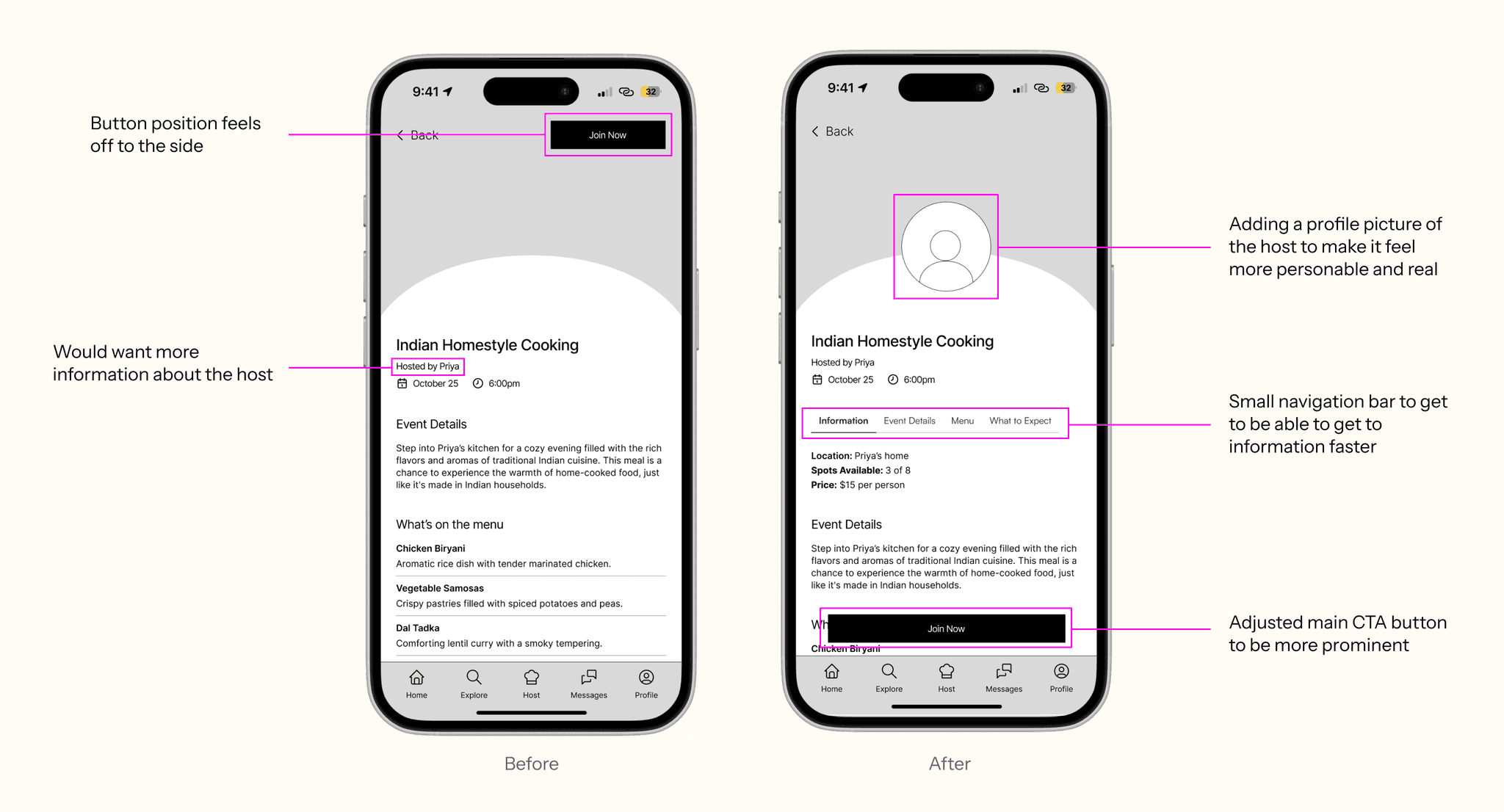
Before and after of screen for more information on an event.
FINAL DELIVERY
Bringing the Designs to Life 🎨
With the foundation set, I refined the UI with color, typography, and interactive elements to enhance usability and storytelling.
Onboarding
Figuring out what the app can do for you.
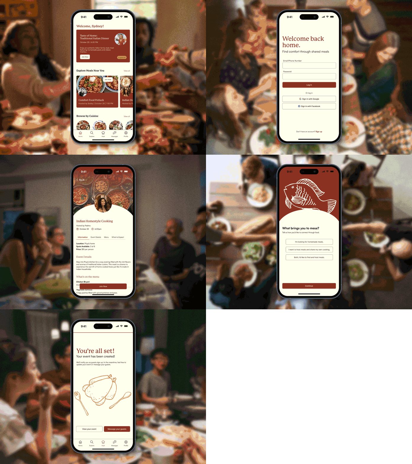
This flow introduces users to the app with a friendly, step-by-step setup, gathering key preferences to personalize their experience while emphasizing the app's community-driven mission.
Highlights:
Welcomes new users
Personalizes preferences for meals
Conversational copy
Finding a Meal
Making connections through food.
Designed for quick browsing, this flow allows users to explore personalized meal events based on their preferences. Each meal features clear event details to help them find and join the perfect shared dining experience.
Highlights:
Personalized meal suggestions
Clear event listings
Easy booking process
Hosting an Event
Sharing your love of food.
Hosting a meal is made simple with intuitive setup options, guest limits, and prompts for sharing the story and menu of each event. This flow encourages users to engage more deeply by creating their own cultural dining events.
Highlights:
Simple event creation
Ability to manage guests
Ability to set preferences
Measuring Success 🔥
User testing with 10 college students revealed that 80% believed Mesa would help them feel more connected. The project also received positive feedback from industry professionals during a portfolio review, highlighting its potential to foster meaningful social impact through food.
Tying it All Back 🪡
Each user flow directly supports the themes of culture, taste, and nostalgia:
Onboarding
Personalizes meals based on cultural preferences.
Finding a Meal
Helps students discover comforting, familiar dishes.
Hosting an Event
Encourages sharing cultural traditions through food.
Reflection & Next Steps 🌟
If I had more time, I would:
Expand features for hosts
Enhance student-to-student connections
Research safety measures for both students and hosts
Further refine branding and app identity
Key Takeaways
Be intentional - Every design choice should serve a purpose
Prioritize impact - Focus on high-value features first
Listen to users - Direct feedback leads to better solutions
The Name: Why "Mesa"? 🍽
The name Mesa (Spanish for "table") symbolizes gathering, connection, and the heart of shared meals. By bringing students together around a table, Mesa fosters community, cultural exchange, and a sense of home.


