Cashflo
Bridging the Financial Gap Through Digital Cash Conversion
0 to 1

Project Summary 📝
OBJECTIVE
Create a seamless solution that enables users to convert physical cash into digital currency at any participating physical store, empowering unbanked and underbanked individuals with greater financial accessibility.
ROLE
UI/UX Designer
RESPONSIBILITIES
Conducted user interviews to understand pain points and opportunities
Participated in weekly design sprints with a team of five designers
Developed 0-1 features and a cohesive visual identity
Delivered a high-fidelity prototype and brand system to support Cashflo’s growth
IMPACT
Our team delivered a MVP, equipping Cashflo’s founders with the tools necessary to move forward in the development process. The final product addressed a key financial accessibility gap, setting the foundation for the app’s expansion and investment opportunities.
UNDERSTANDING THE PROBLEM
Challenges Faced by the Unbanked 🧐
Millions of people remain unbanked or underbanked due to mistrust of financial institutions, lack of accessibility, or a preference for managing finances independently. This presents significant barriers to digital transactions, online shopping and financial growth.
"In an economy that runs on the assumption that individuals have full access to traditional banking, living without that access has a number of costs."
— Forbes
Our Mission
Cashflo's founders envisioned a world where anyone could digitize their cash at local convenience stores, empowering them to participate in e-commerce, investing, and digital transactions. Our task was to bring this vision to life through a product that was both easy to use and reliable.
Select screens of Cashflo that allow you to view locations of point-of-sales locations and editing your profile.
DISCOVERY
Workshops to Define the Brand 📌
To create a user-centric product, we conducted discovery workshops to clarify Cahflo's mission, target audience and key features. These exercises helped us to align on a brand personality and establish design principles that emphasized the following:
Trust & Security
Simplicity & Accessibility
Modern, yet Friendly Aesthetic
Everyone initially came up with their own statements, but after some discussion we settled on the above problem statement to guide us through the rest of the project.
Another workshop that we took part in was continuums. This helped us align with the founders to understand more of the product experience and brand.
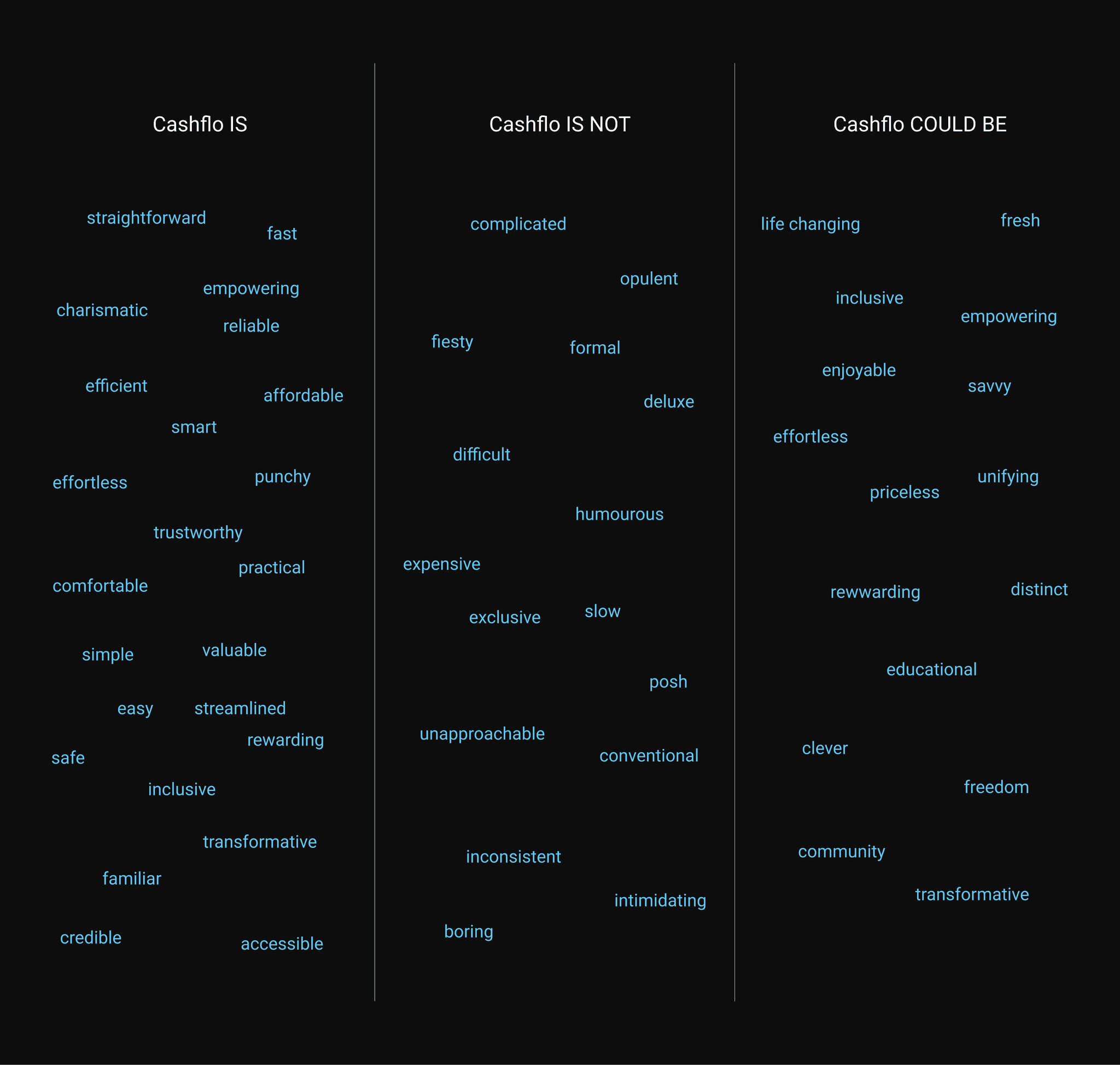
The last workshop that we had helped us to pull more specific words that described the brand. This helped put ourselves in the users shoes and how they would perceive the brand.
RESEARCH
User & Market Research 📊
User Interviews
We engaged with potential users and industry experts to understand more about this problem space, from pain points to behaviors.
Competitive Analysis
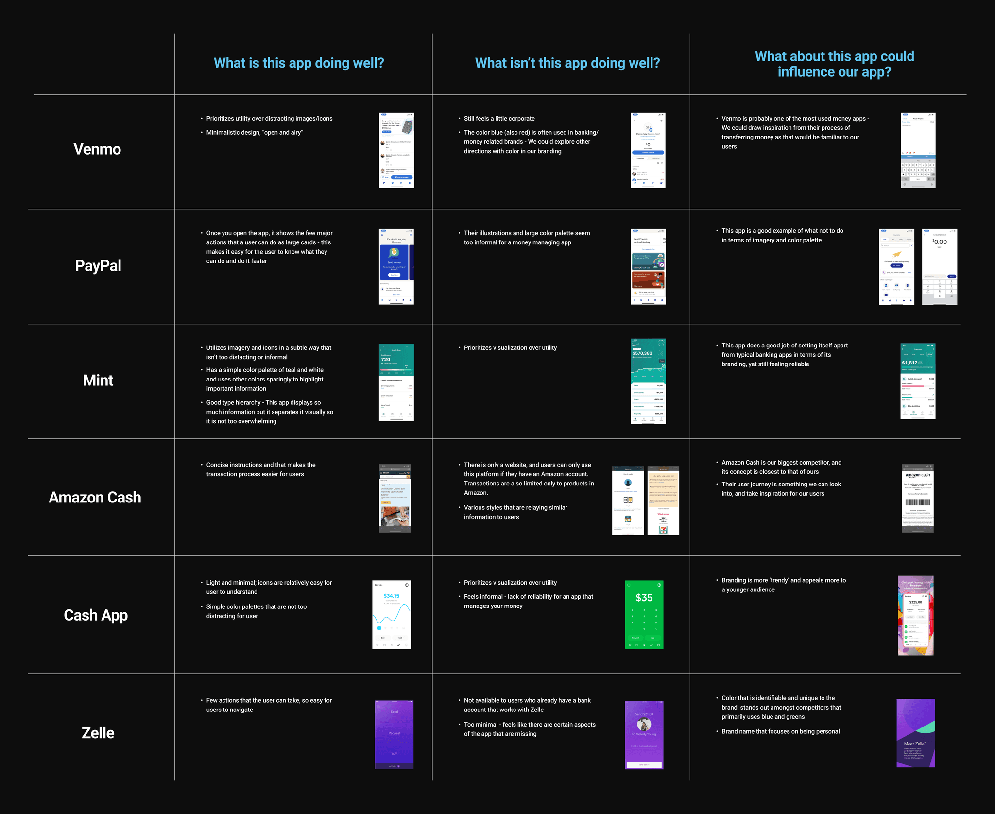
We evaluated different fintech apps with money transfer features, identifying strengths and gaps in the market.
We did a quick market analysis, examining products that also have similar flows of transferring money. We looked at what they did well, and what could be improved and what features we could possibly implement in our own solution.
Feature Prioritization
We created a backlog to separate must-haves from nice-to-haves, ensuring a focused MVP.
Key Findings
Users needed an intuitive and trustworthy experience that didn't feel overly "corporate"
Many fintech apps were designed for tech-savvy, leaving unbanked individuals behind
The app's name should reflect its ease of use and reliability, thus, Cashflo was born
DESIGNING THE SOLUTION
Building Cashflo's Brand 🖼️
We explored three visual directions before finalizing a look that balanced approachability with financial credibility. the chosen direction featured:
High contrast and simple UI for readability
Playful yet trustworthy illustrations to ease apprehensions
A flowing, custom logotype symbolizing seamless money transfers
Final moodboard of our visual direction.
Sitemap & Wireframing 🗺️
Initially, we mapped out a comprehensive user journey covering multiple possible interactions within the app. However, given constraints, we refined our scope to focus on two key flows:
Sign-up & account setup - A smooth onboarding experience to establish trust
Cash conversion process – A simple, guided flow to upload cash at store locations
By prioritizing these essential user flows, we ensured that Cashflo remained intuitive and efficient while addressing the core needs of unbanked users.
Usability Testing 🧪
We tested our prototype with users to refine the experience. Below is some of the feedback that we received for each flow.
Sign-up Flow
Combine name, email, and password fields for efficiency
Split profile setup from account linking to reduce cognitive load
Cash Upload Flow
Added instructional screens for clarity
Made QR code scanning more intuitive
Introduced an option to replay instructions for new users
These refinements significantly improved ease of use, ensuring Cashflo met the needs of its target audience.
MVP
Final Product & Impact 🚀
Through rigourous design iterations and user feedback, we were able to deliver a MVP to our clients allowing them to take Cashflo to the next steps. This project was a testament to the power of human-centered design in fintech. By focusing on real user needs, we built a product that could drive meaningful financial inclusion.
I helped to create the illustrations that our users would go through in order to understand the purpose of Cashflo.
The final sign-up flow guides you through creating a Cashflo account and connecting additional accounts.
The final upload flow shows how users can upload cash into any account once they go to a point-of-sales location.
Reflection & Next Steps 🌟
Asking the right question is key. Observing users and teammates helped me to sharpen my own problem-solving skills.
Small details make a big impact. Typography, spacing, and color choices were crucial in establishing trust.
Collaboration is everything. Working with a talented team taught me the importance of iteration and feedback.
Looking Ahead
By the end of our collaboration, Cashflo was equipped to move forward with development, bringing financial empowerment o unbanked individuals. This experience reinforced my passion for designing with purpose, solving real-world problems through thoughtful, human-centered design.
TEAM
Project Lead - Ethan Pidgeon
UI/UX Designers - Ally McCabe, Julia Schaeffler, Shannon Haley, Vanessa Peng


