Project summary 🗒️
OBJECTIVE
Create a seamless, user-focused mobile experience for quick access to key information.
ROLE
Product Designer
RESPONSIBILITIES
Redesign and modernize SearchNEU’s mobile interface to address the needs of on-the-go users by improving usability, enhancing functionality, and ensuring a seamless experience for quick and convenient access to essential information.
Conduct user research to understand pain points, prioritize features, and validate design decisions that align with user needs.
IMPACT
The updated mobile design will improve user satisfaction, increase engagement among mobile users, and align SearchNEU’s platform with the expectations of today’s mobile-centric audience. This will strengthen the platform's overall utility and accessibility.
THE PROBLEM
The outdated mobile experience limits user engagement, restricting overall platform usage and preventing us from fully serving our student audience.
Prioritizing Mobile for On-the-Go Users 📱
SearchNEU’s mobile designs have often taken a backseat, with most updates and improvements focused on the desktop experience. However, we wanted to prioritize a different group of users—those who rely on it for quick, convenient access to class locations, schedules, and checking if seats are filled. Recognizing the importance of mobile, we decided it was time to give the mobile design the attention it deserves with a much-needed update.
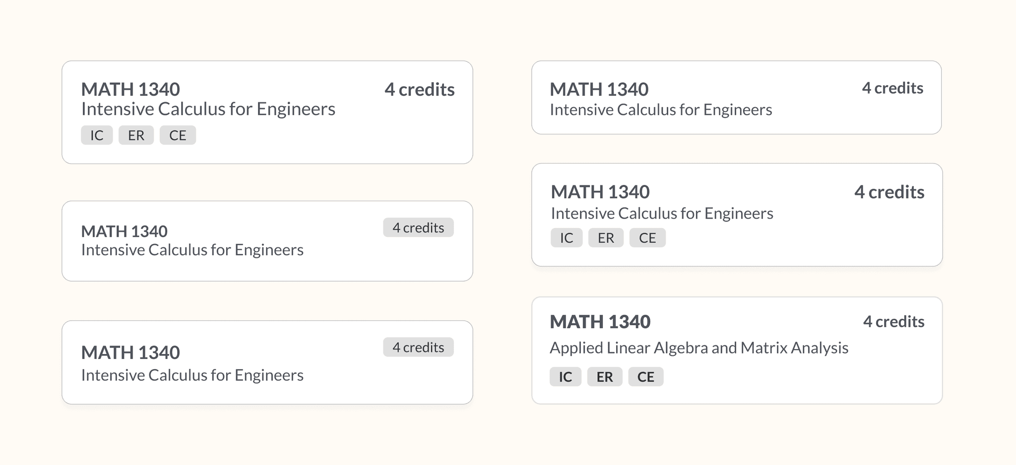
COURSE CARD EXPLORATIONS
Showing course name, credits and requirements

Conducting UX Research 📝
Before started to design, we conducted UX research to figure out what aspects of a course students consider most important. I sent a Google Form to students students across various years and majors to figure out how they rated the importance of different pieces of course information.
Students were asked to rank each piece of course information from 1 (not important) to 5 (most important)
Research Findings 🧐
Besides the course name, our research confirmed key parts of our hypothesis. Class schedule (day and time) and available sections were the second and third most important factors. The next most important detail was the campus location, which makes sense given Northeastern’s global presence. We decided to combine this with the class location—the specific building and room where the class would be held.
COURSE CARD EXPLORATIONS
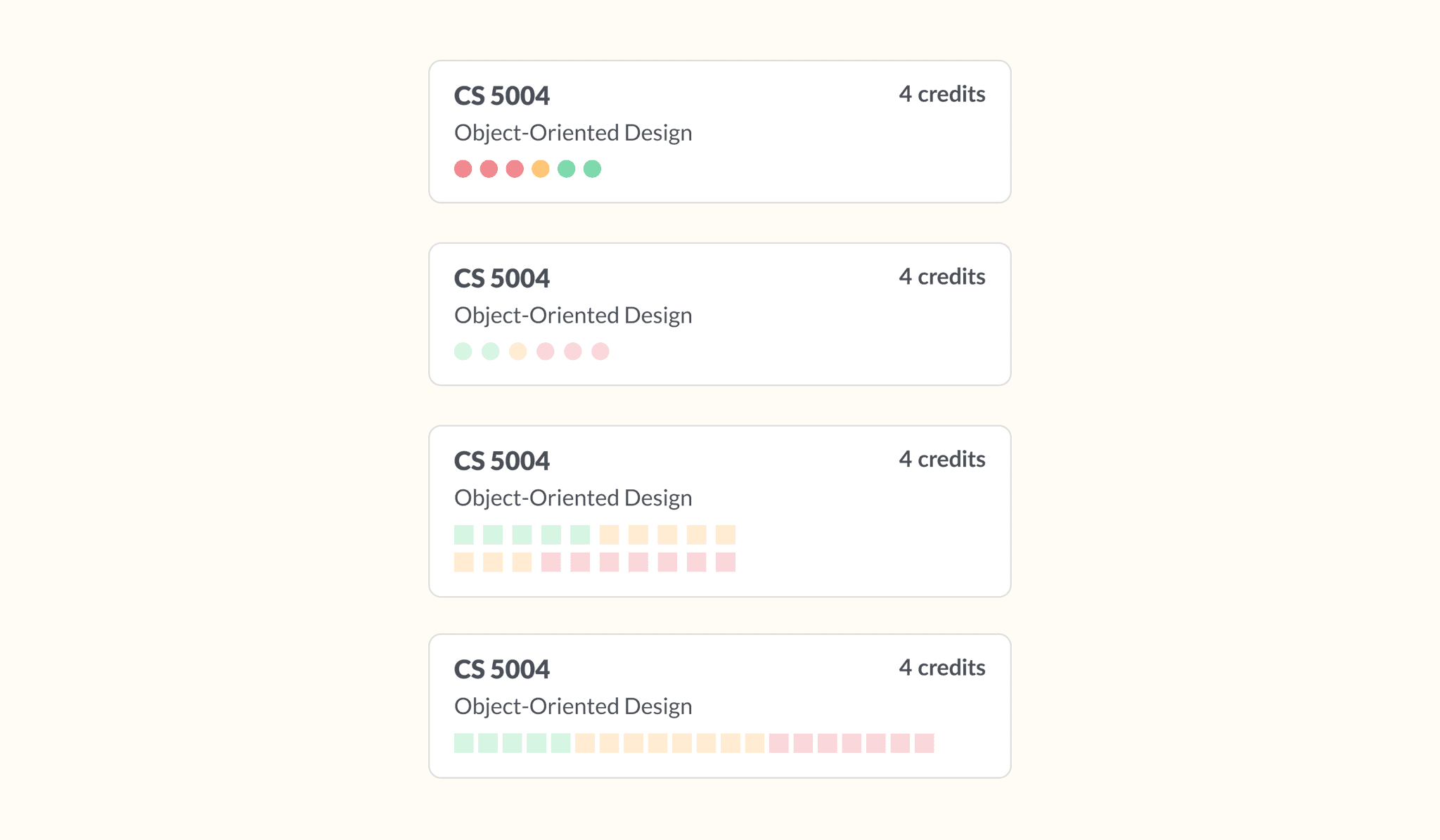
Representing seat status visually

COURSE CARD EXPLORATIONS
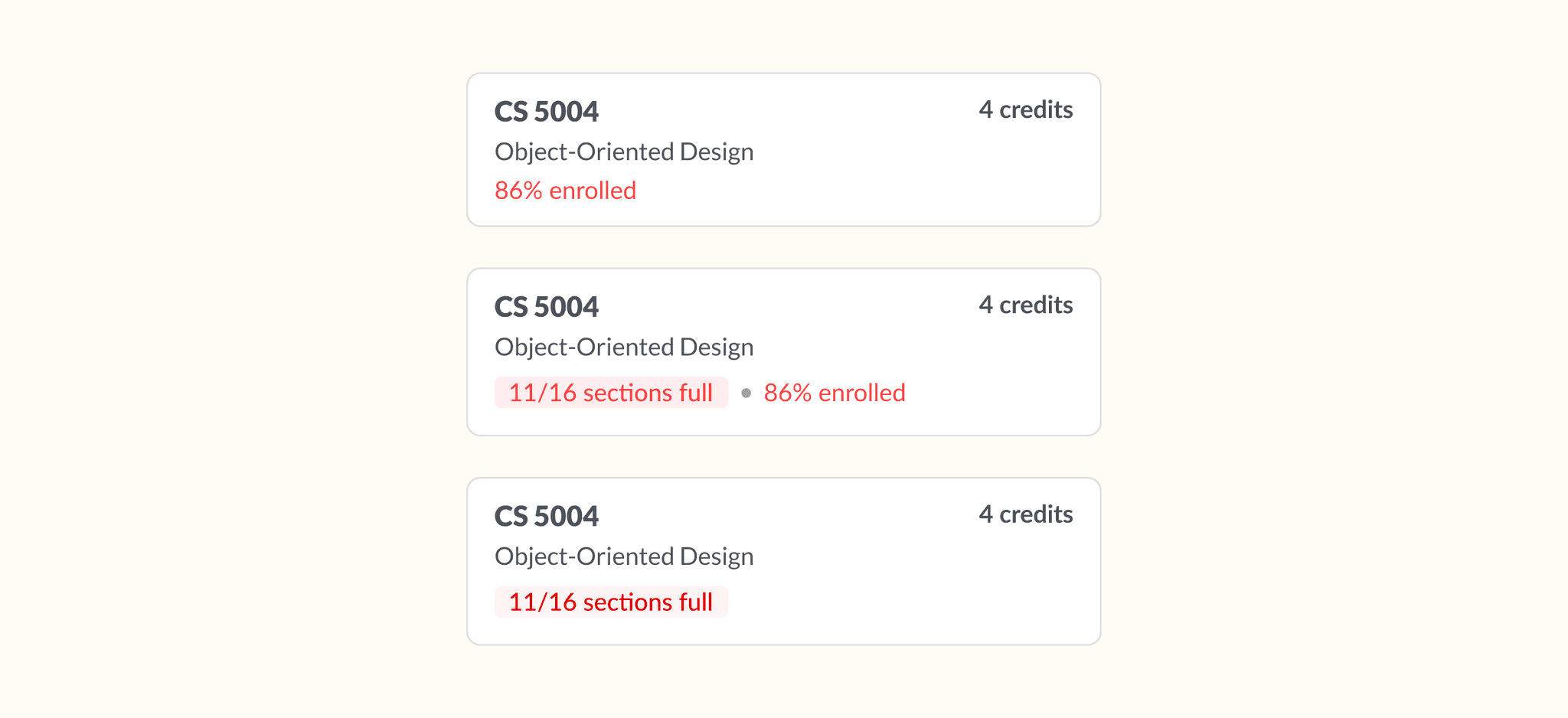
Representing seat status numerically

MOBILE EXPLORATIONS
Allow students to see seat status at first glance
Course Cards: Before & After ✨
The final product is a modern, user-friendly mobile design that prioritizes convenience and accessibility. We focused on key design decisions, such as emphasizing available sections ensuring the most critical information is easy to find at a glance. The updated interface balances a sleek, modern aesthetic with functionality, reflecting SearchNEU’s legacy while addressing the needs of today’s mobile users.


