Overview
About
SearchNEU (aka "Search") is a student-built alternative to Northeastern University’s class browsing tool. As a designer for multiple semesters, I contributed to various projects and got to see it grow with different members. I collaborated with developers and designers to make decisions on UI elements, standardize the design system, and design new features such as a notifications page.
What makes SearchNEU different?
SearchNEU offers a better experience for looking up courses and professors compared to the existing tool that Northeastern University offers to us. This is critical for students, especially during course registration.
🔑 Accessible
We don't require users to sign in to browse classes and they can easily look us up.
🛁 Clean UI
We offer more intuitive UI so that users can easily navigate to the information they need.
🌱 Constant Improvements
We are always asking our users how we can improve their experience.
Banner, Northeastern's official course catalog
Searching is more tedious, requiring users to know both the course number and subject.
SearchNEU
Offers flexible search, users can just input phrases or shortcuts to find courses.
Introducing new features with developers
New designs and features are constantly being added to SearchNEU. Given the long history of the project, I worked together with developers to ensure that these new elements aligned with the overall brand while providing a fresh feel.
Did you know about this?
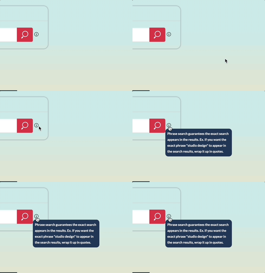
One of my first tickets on the team was to introduce phrase search to our users. We designed a tooltip to ensure that people were aware of this, allowing them to search more precisely.

Depending on what we wanted to tell our users, we chose to add elements that we thought were most suitable.
SearchNEU needed funding, and to appeal to potential sources, we asked our users on how SearchNEU has helped them. I created iterations of potential toasts asking for testimonials. We ended up going with the middle design since it was simplest.
GraduateNU is another project by Sandbox and that helps Northeastern students develop plans of study. To spread word of their release, I worked together with their designers to come up with banners that notified our users. We ended up going with the middle design.
Understanding more of our users: deans, administrators and professors
While SearchNEU is widely used by Northeastern students, our audience also includes Northeastern faculty. As students, we understand our peers' needs to some extent. However, we wanted to learn more about how administrators and professors use SearchNEU and how we can improve their experience.
I conducted research through interviews and surveys to find out more about why they use SearchNEU. Through an interview with an associate dean, she brought up a new feature idea—to allow for filtering by college. This would greatly enhance her current workflow, and we saw it had potential for helping others too.
Along with an additional filter, I also updated the filter bar as a whole.
We enlarged the filter bar, giving it more breathing room. In contrast, the previous version certainly feels more cramped.
We refined the dropdowns, toggle and range. The new versions greatly improved accessibility.
We changed the checkboxes to a dropdown for class type. This helped to keep everything just a bit more consitent.
Establishing a design system
As mentioned before, SearchNEU has been around for a while. The first version was launched in 2017 by Ryan Hughes. Since then, 36 people and more have touched the project—including the Figma files! When I first joined, I was overwhelmed by different versions of just about everything and the lack of established styles. ;( One goal that I set for myself was to establish a design system that can help improve the experience of those working on the app.
Implementing a color system significantly enhanced our internal workflow. It benefited both myself and the developers in making sure we were consistent throughout the designs and the codebase.
From the broader color system, we pulled specific colors out to help establish our branding and also colors that make up the rest of Search's UI. This new organization really helped us to maintain the app's overall design.
Going through an audit of the existing type styles we had, we were better able to standardize type throughout both desktop and mobile.
Learnings & Reflections
Being on SearchNEU is definitely something I will remember forever. I got to work on an impactful project for the Northeastern community with so many incredible people. Some of my takeaways and reflections:
😁 Developers are people too.
This was one of my first experiences working closely with developers. I used to think developers were intimidating, but through continuous conversations with them, I came to recognize the important exchange involving both idea generation and practicality.
💭 Always keep asking users what they think.
It became clear to me early on that no one was going to tell me what to do, especially during the time when I was the only designer. To figure next steps, I turned to users to see what they wanted to change on the app. This helped to not only create more tickets for myself, but also ensure that we were constantly improving our users' experiences.
Impact & Testimonials
SearchNEU has become a pillar of Northeastern's community, an essential tool to ensure that people get the classes that they need. Although it started as a tool for students, our users have grown to reach Northeastern faculty, which has been really gratifying to witness.
“SearchNEU’s convenience, speed, and better UI make it perfect. No need for Duo authentication to look for classes.” — Northeastern Student
“I’m a CS faculty and assistant director at NU Vancouver. SearchNEU is essential for my workflow. Banner’s UI is outdated, but SearchNEU is responsive and extremely useful. Kudos to everyone who maintains it.” — CS Faculty
"I missed the summer class registration deadline, but SearchNEU's SMS reminders helped me secure the classes I needed to graduate on time." — Northeastern Student


